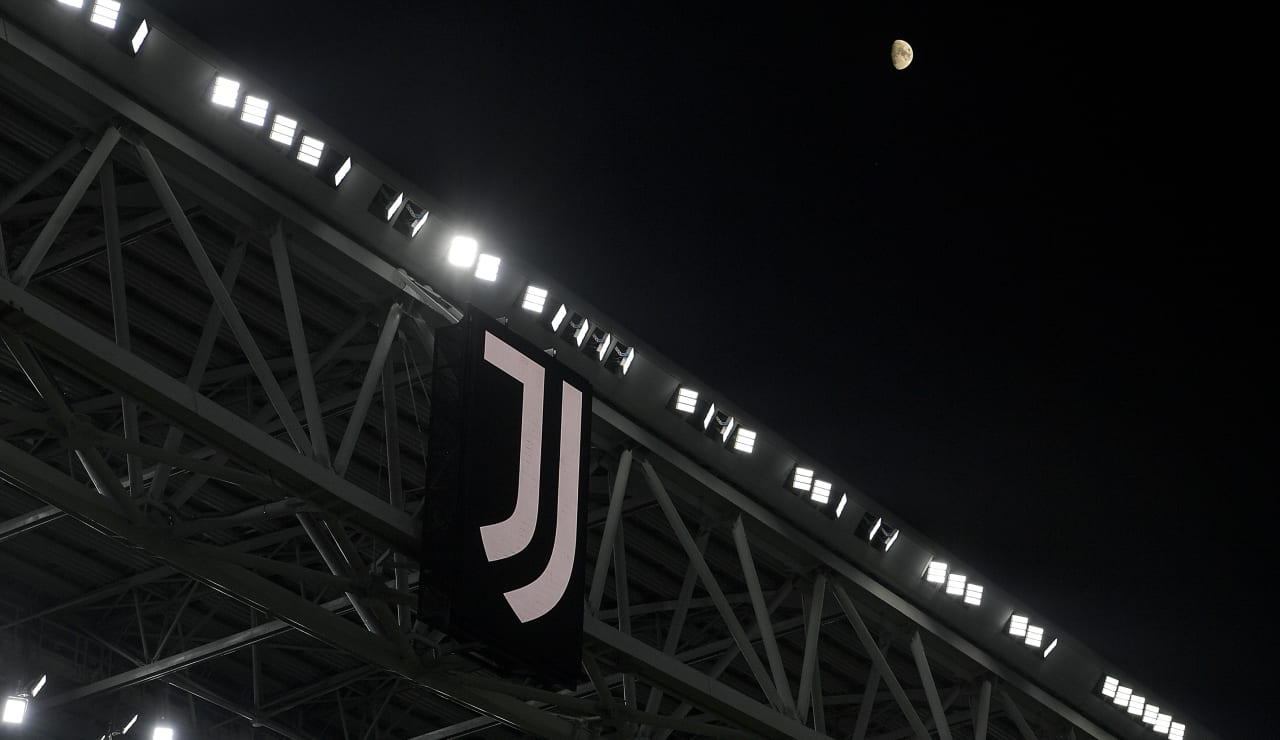
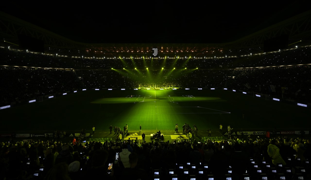
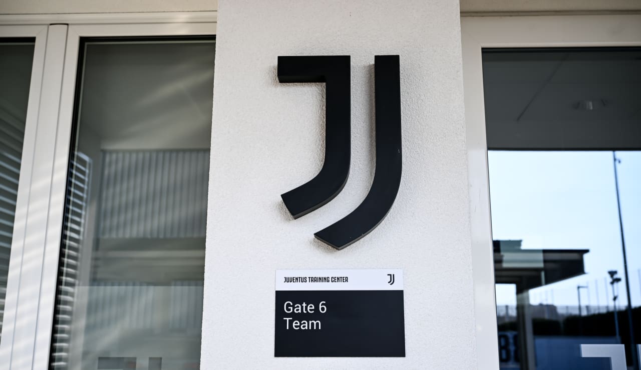
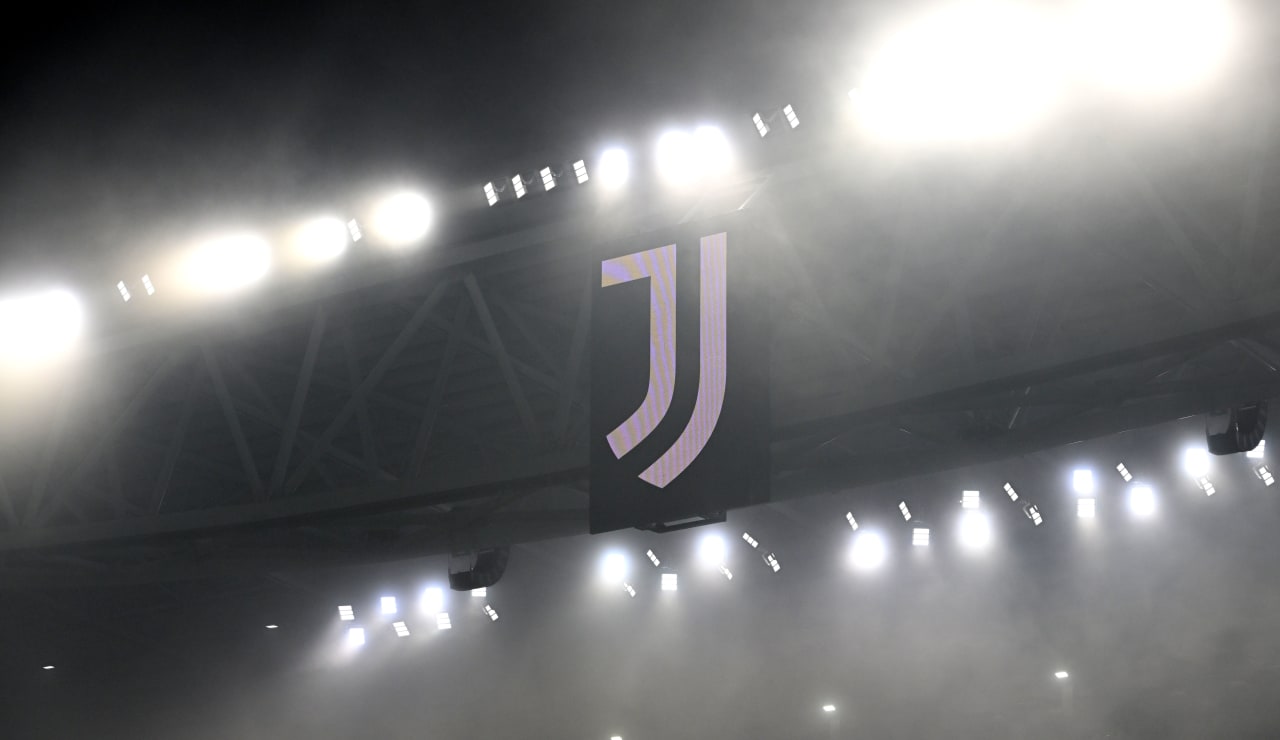
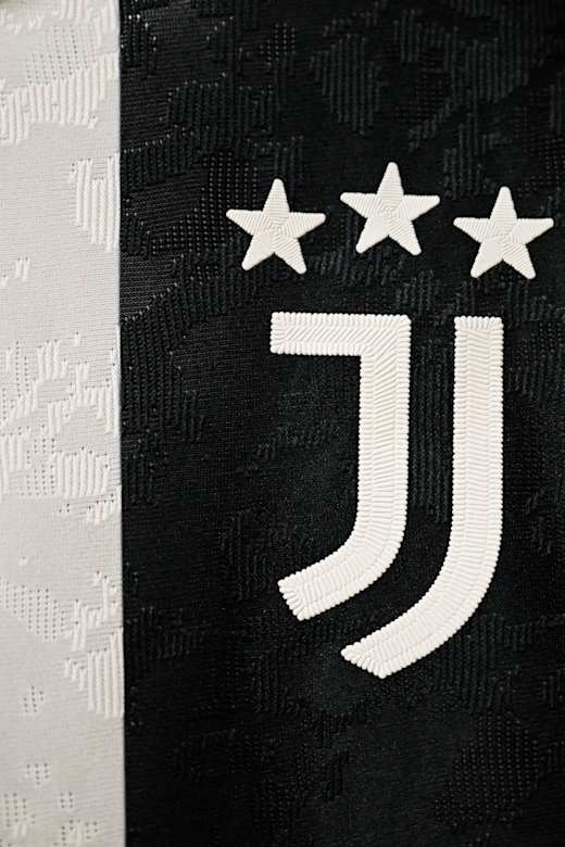
ICON. THE JUVENTUS LOGO.

If you search for the meaning of the word "Icon," you will find this definition: A message entrusted to an image.

This, then, is the deep meaning for those who study symbols: an image, or a logo, with which one identifies in a unique way.
It is no coincidence that the Juventus logo is called precisely that: Icon.

It has been part of Juventus' visual identity since January 16, 2017, the date of its unveiling to the world and the day Juventus launched one of the biggest "rebranding" operations ever seen in world football.

THE IDENTITY OF A BRAND

It’s a journey that began in 2017 and continued in 2020, which has led the club to become, also visually, a global brand, one that finds its highest expression in football and its closest connection to a worldwide audience.

BCR22BF0289

JUST J

Juventus is its own Icon, and the Icon is the most concise and complete representation of what the Club truly is—something that encapsulates and represents it 100%, without the need for surplus words. For this reason, the second step of our visual identity saw, in 2020, our logo becoming just a J, without the word "Juventus" above it, as it had been for the previous three years.

This is because the Juventus logo is Juventus: to it’s core, created from the iconic black and white stripes.

It represents the identity of our brand, while still embodying our ongoing ambition for victory: the graphic line, in fact, ideally forms the shape of the Scudetto, which is one of our goals.

Always.

logo