28 April 2017
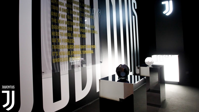
Juventus’ future is already making waves in the world of design. The Bianconeri’s new visual identity, created by Interbrand and launched on 16 January during the Black and White and More event in Milan, has won two categories at the D&AD Professional Awards ceremony 2017: the Graphite Pencil in Branding Schemes, Large Organisation and the Wood Pencil in Crafts for Design, Typefaces.
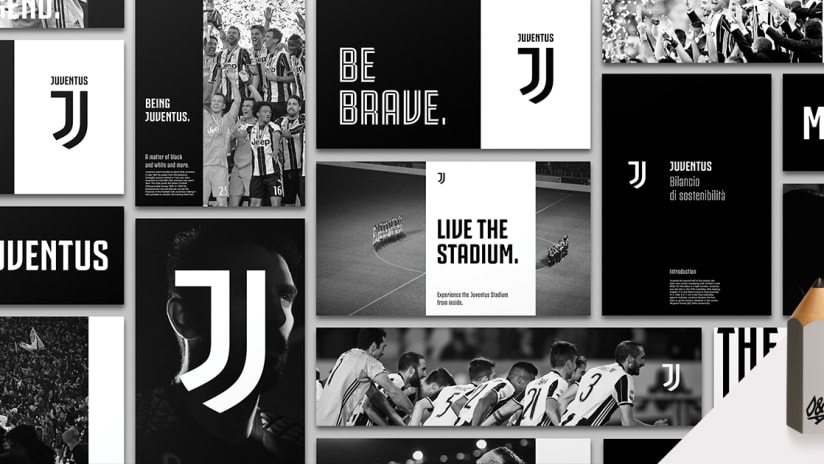
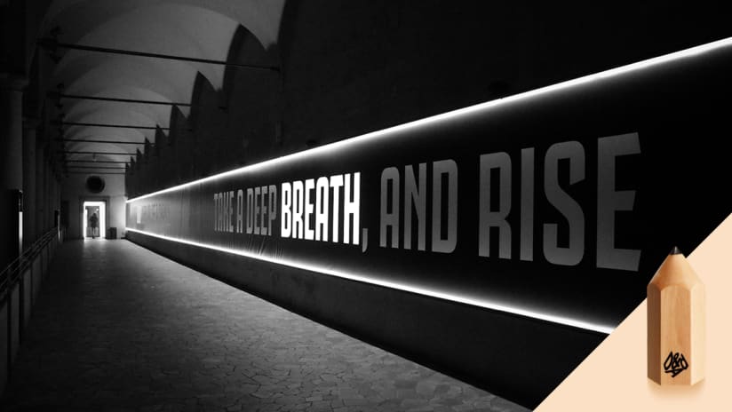
Since 1962, D&AD stands for excellence in creative, design and advertising communities and its Professional Awards are recognised globally as the ultimate accolade in its field. Therefore on Thursday night, after the three-day Festival of Design held in London, Juve’s new logo and new font entered the elite of style and fashion.
The logo unmistakably encapsulates the essence of Juventus: the J in the name, the stripes on the jersey and the Scudetto shield. These three elements are blended into a single, universal symbol capable of representing not just a football team, but also an identity and a strong sense of belonging.
The strong and sharp appearance of the letters owes itself to the solidity of the font’s structure, characterised by class, rhythm and elegance.
Juve’s future is one in which the club sets out to broaden its horizons to an ever-expanding audience, who recognise the Bianconeri’s ability in changing the way people perceive football brands, while transmitting the true spirit and DNA of Juventus.

